Ambi Nikhil Revised
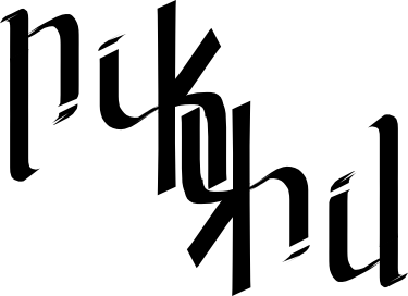
This is a way better version of my name, My friends said the K wasn't easy to read in the first and looked like nifkil, so this one is with the name split over two levels . This not only makes it readable it gives a tightness to the word, and doesn't leave excess whitespace