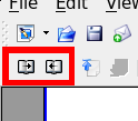
Counterintuitive Writer Page Preview icons

Notice how the next and previous icons represent two things. In the context of turning a page the icons are in their right positions, the one to the left turns back the page, the one to the right moves to the next page. But most users will probably notice the arrows first. And in that context the arrows are in the wrong position. Is it just me or does this confuse everyone?